Tuesday, May 10, 2011

Life Imitates Art...

My most favorite playwright Oscar Wilde once wrote, “Life imitates Art far more than Art imitates Life”.   This expression couldn’t be more true when it comes to the masterful way that creators of the film The Thomas Crown Affair, incorporate major works of art. 
"The Son of Man" 1964 by Rene Magritt 
The rhythmic music of Nina Simone’s song Sinner Man, creates the anticipation and momentum as the major finale of the movie sees an all powerful and art loving thief protagonist Thomas Crown replacing a stolen work of art. He along with many long overcoat and bowler hat dressed men fill the Metropolitan Museum of Art in New York City, all to outsmart the police.

This direct nod to the painting entitled “The Son of Man” by Rene Magritte is a whimsical and artistic way to bring this self-portrait to life.  As in the painting where the face of the man is obscured by a hovering green apple, so too are the faces of the many men trying to evade discovery of the real perpetrator by a crowded room of people.

I believe it is cinematic genius, and I hope you enjoy it as much as I do!

Saturday, May 7, 2011

Looking for Picasso and found Dora


Sick on the couch this weekend and catching up on current affairs with BBC Canada, a segment on the new Picasso exhibit on now at the Virginia Museum of Fine Arts, caught my attention.

I was very sad to have missed seeing Musee National Picasso Paris on my first visit to the named city last year. I now learn that while it is under construction until 2013, the museum has put together a collection of pieces that will travel to four venues – it’s first stop in little old Richmond Virginia.

You would think that only the top art museums in major cities like New York, and London would be offered or could afford to bring such a high profile show as Picasso’s masterpieces. Instead these pieces will be on display in more unique venues that will draw a new crowd of people.

"Portrait of Dora Maar Seated" 1937 by Pablo Picasso
One of the many remarkable works in the collection is “Portrait of Dora Maar Seated” (1937).  Dora’s personal impression on Picasso’s life was deeper than just one of a long line of lovers. They were intellectually intimate, and as a Spanish speaking surrealist photographer, she was very involved in documenting his most monstrous creation "Guernica" – a violent representation of the Spanish civil war.

It has been said that you can understand their cerebral connection by the way he represents her in this portrait. She is elegantly clothed with her long red tipped finger nails pointing to her ear symbolizing his respect for her intelligence.

The next stop for this group of surrealist masterpieces is San Francisco, California at the de Young Museum from June to October 2011; so if you take a trip down the coast I strongly suggest you go and look for Dora. 

Sunday, April 3, 2011

Pretty Parking

I didn't know parking lots could be so pretty until I attended a free lecture put on by the Vancouver Institute; Saturday night about architect Bing Thom.

View of the parkade with soccer pitch above
The fascinating retrospective of the work of his office Bing Thom Architects Inc. entitled The Transformative Power of Architecture: The Works of Bing Thom, showcased projects in China, the US and on Canadian sole in Alberta and B.C. A look through the projects section of their website, will give you a visual representation of the slideshow he provided along with his insightful thoughts on how to better build cities and cultural spaces.

What most caught my attention was a project he completed in 2009 in Calgary, Alberta for the SAIT Polytechnic campus. Specifically they were asked to build a three-level parking facility which was to support a year round soccer pitch on the roof.

For most, parking garages are utilitarian in look and purpose. Usually they are made of ugly grey concrete, have bad lighting and even worse security which make them the least desirable place to spend time. 
Bing Thom and his team set out to make the SAIT parkade better, and succeded with architectural solutions to bad connotations that they bring. However they took it one step further and thought about aesthetics by hiring Vancouver artist Roderick Quinn.
Close up of punched holes
In combining a way to create ventilation for the parking facility without mechanical help, Roderick Quinn created 4x4 panels of clear anodized aluminum with holes strategically punched into them. These holes not only allowed for ventilation and natural light for the interior of the parkade, but on the exterior they create a giant outdoor work of art. As the sunlight interacts with the facade, the image of an Alberta prairie sky is depicted and changes as the sun rises and sets. Even at night time the image glows from the interior lights. 

Close up images of the Alberta sky image

I for one, would love to see more utilitarian buildings be made with as much thought, care and creativity as Bing Thom and his team have put into this parking facility. If architects, developers and city planners begin to open the discussion on how better to meet the needs of the end user, but also to add beauty to our urban landscape, we will all begin to see some positive changes in our communities. So I ask, are there other buildings and architects out there doing similar things around the world? I would love to hear from you and learn more!


Thursday, March 3, 2011

East Van

Growing up in Vancouver, regardless of where, you understand the not so subtle differences between east and west.
"Monument to East Vancouver" by Ken Lum
Closer-knit dwellings with light industrial store-fronts illustrating the apparent cultural diversity of the area on one side and on the other you find wide-open spaces, houses with large lawns and chic boutiques.
Until recently, property value was the definitive factor between east and west, but with the escalating pr ices of real estate, the divide between them is now blurred.
It was this dichotomy between east and west that intrigued artist Ken Lum to design what he calls a cultural ‘marker’. The cross design of the words ‘east’ and ‘van’ each share an ‘a’ in the middle, was commissioned as part of the Cultural Olympiad for the 2010 Olympics.
Ken explained in a recent artist talk at the Vancouver Art Gallery that the cross is in reference to the working class catholic inhabitants of the east side of Vancouver in the 1940’s and 50’s, but since then the diversity of ethnic backgrounds has definitely changed and thus the cross takes on many more meanings. 
Interestingly he did not come up with the actual image as it has been found in graffiti tags across the east side for years; however it was important for him to showcase the hushed differences as a symbolic reminder for generations to come.
As a city changes, gentrifies and revitalizes itself, it is more important than ever before to have references to the past, to remind us of pivotal points in history that marks the very apparent changes.
Check out this Youtube video on the making of the sculpture.

Friday, January 28, 2011

This

The cast of "This" performing at Vancouver Playhouse Theatre
Self reflection is never easy, especially when a work of artistic fiction makes you confront your inner most thoughts. This is what "This" did for me.

Always a supporter of the arts, it was a no-brainer when I was invited by my good friend Fabrice, to watch him star in the performance of "This" at the Vancouver Playhouse Theatre. Appreciating the talents of his photography (have a look at his blog / website for the most incredible photos - www.fabricegrover.com) I realized I had never seen him perform live!

Not only was his performance fantastic as the love interest for the one and only Meghan Follows (formally Anne Shirley in Anne of Green Gables.. my childhood favorite!) but the character he plays - a French doctor without borders, gave the fresh perspective to the self involved set of personalities and relationship issues presented in this play. There is a moment towards the end of the play where 'Jean-Pierre' makes the characters and the audience poignantly realize how petty it is to worry about the he-said she-said, self loathing and time wasting thoughts we all have, when people less fortunate than ourselves are suffering all around the world.

This continues to be, for me, the reason we need to keep all artistic pursuits alive in our schools and community at large. Art in all its forms is like a mirror, showing us the good, the bad and the ugliness of our society, and gives us pause to reflect on uncomfortable topics, such as our societal guilt and selfishness.

Thursday, January 20, 2011

Silent Melodies


"Silent Melodies" by Mizzonk
When I am moved by the brilliance of how a piece of art is made,  I could stare at it for hours - lucky for me I have the rest of my life to do just that.
While perusing the many talented artisans at the One of Kind Vancouver show, I came across an amazing couple who make the most beautiful works of art by meticulously cutting out eye catching paper masterpieces.  With several creative series to choose from, each one is unlike the others.
In speaking to the one of the co-creators of the work, I was almost speechless  in my admiration at the skill and patience it must have taken to create each piece.  Silent Melodies as my new treasure is called is based on the essence of music and reminds me of both piano keys and even the metal plates that used to glide over the metal stubs on the music boxes we had as children.
The simplicity combined with the complexity of the design, is for me the most powerful part of this amazing Christmas gift.

Check out this amazing couple and all of the art, furniture and gifts they produce under the company name Mizzonk.. and they are based in Maple Ridge!

Friday, November 12, 2010

Everyday Object


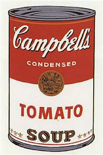
When does an everyday object become fine art? When someone famous says it is.  Andy Warhol’s depiction of Campbell’s soup cans comes to mind as the ultimate reference of a household item that is synonymous with “high art”, which is collected, sold and hung in museums.
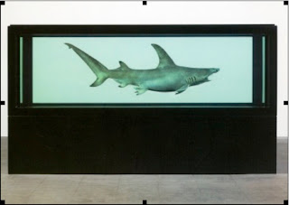
Many artists in the 20th Century have followed suit, but none so prolifically as Damien Hirst who arguably is the most famous living artists today. Just as many have argued that silkscreen prints of soup cans is not ‘art’, so too have people snickered at the often scientifically morbid fascination Hirst has with preserving dead animals.
His notoriety is not only based on his subject matter, but also that he considers himself more as a businessman than an artist. Interestingly he has refused representation by the major art houses, and has chosen to sell directly to the major auction houses instead, therefore cutting out the middleman. Few artists have the shrewd ability to sell and market their own work, let alone catapult their careers in order to fetch millions of dollars for a single work of art during their lifetime.
Most notable was the sale of a shark killed in Australia, preserved in formaldehyde and encased in glass, that sold at Sotheby’s for $100, 000, 000 pounds. Now a shark is definitely not an everyday object, but preserving a dead animal, and calling it art is a far cry from soup cans.
Although Warhol and Hirst each explore very different subject matter they both had the technical know-how in creating their work, yet the question remains as to whether there is real creativity and artistic mastery present in the art they have produced?
I would argue that Hirst skirts a very fine line in creating a valuable contribution to the evolution in art (regardless of whether the art world values it as such) versus a scientific display of dead animals that people must now accept as commonplace in museums.